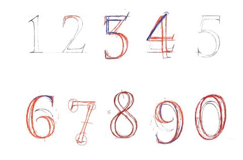
 My first numbers draft showing Charlotte's corrections. Numbers! In my last post I mentioned my certainty that I must already know all there is to know about letters through the mere act of existing and moving through the world - and my subsequent struggles when it came to capturing their essence in detail. Numbers were no different. I remembered my City and Guilds of London Art School tutor, Tom Young, explaining that some numbers sat above the line whilst others fell below it. A little knowledge can be a dangerous thing as it came to recalling which did what - and resulted in the tangled mess above as I stretched and shrunk what I thought I knew of numbers to what I thought I knew about layout. Luckily for me I have my LAT Journeyman tutor, Charlotte Howarth, to straighten me out me: 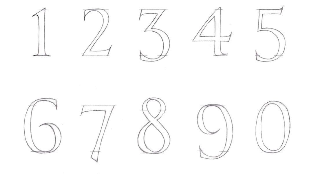 Second draft, and what a difference. 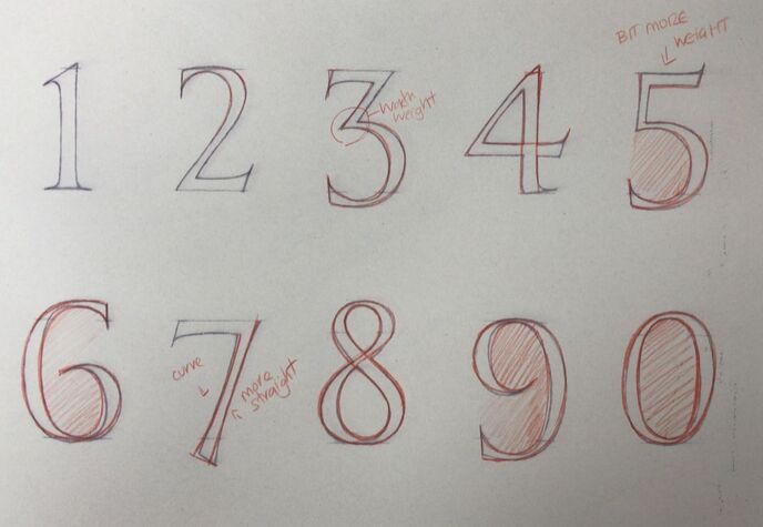 Yet not without Charlotte reminding me that perfection is a long game. 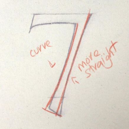 But worth it when you get beautiful things like this number '7' appearing in your inbox.
0 Comments
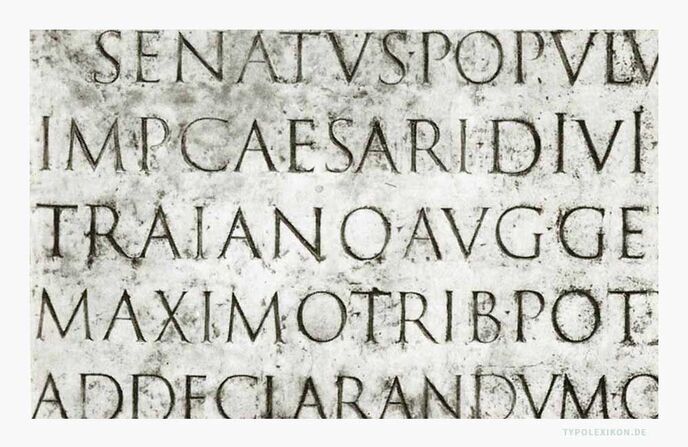 The marble plaque of the 'Columna Traiana' in Rome. 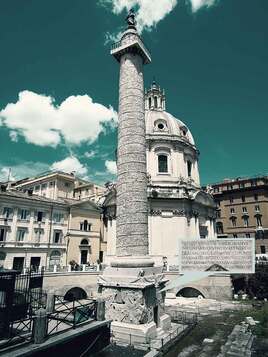 The Trajan Alphabet: "...The Roman capitals have held the supreme place among letters for readableness and beauty. They are the best forms for the grandest and most important inscriptions." - Edward Johnston The most popular Roman capitals are to be found on the Trajan Column - a triumphal column in Rome commemorating the Roman emperor Trajan's victory in the Dacian Wars. At its base, it features a marble plaque considered by many to contain the most beautiful surviving example of 'Capitalis Monumentalis' script - and with sufficient text to form an alphabet (with the exception of H, J, K, U, W, Y, Z). (The modern alphabet has grown since, with the letters 'J', 'U' and 'W' added during the Middle Ages - read more about the Trajan alphabet and Capitalis Monumentalis script (translation required).) When, back in 2017, I was lucky enough to study for a few days with the renowned lettercutter Richard Kindersley, my very first task was to draw out a Roman alphabet based on the Trajan Column example, from memory. From memory, easy! After all, what does your eye take in more of every day than letters. Letters are everywhere I look, and I had had 31 years of absorbing them. This was going to be a cinch. Except... which are the thin strokes on a 'W' and which are the thick? How does the junction at the centre of an 'R' form, exactly? Just how wide is an 'M'? Is the crossbar of an 'A' the same height as the crossbar on an 'E'? (it isn't...) And just what do the curves on an 'S' think they are playing at, really? 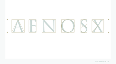 'The typometry of the Roman capitals in the two-line system consists of straight lines and curves, or the basic forms square, triangle and circle. Nothing has changed to this day. Example set from Linotype's Trajan.' (from typolexikon.de) 'A Lot of People Don't Know What Lowercase "G" Looks Like And We're Not Even Kidding' - ScienceAlert.com It was a fantastic learning exercise and therefore no coincidence that my LAT Journeyman tutor Charlotte Howarth also tasked me with an alphabet as a fundamental step in my learning - an important return to basics and a useful tool to 'see where I am at' with my own understanding and personal development of form. First was the Trajan alphabet, as we understand it in full modern form, an uppercase version and a lowercase: 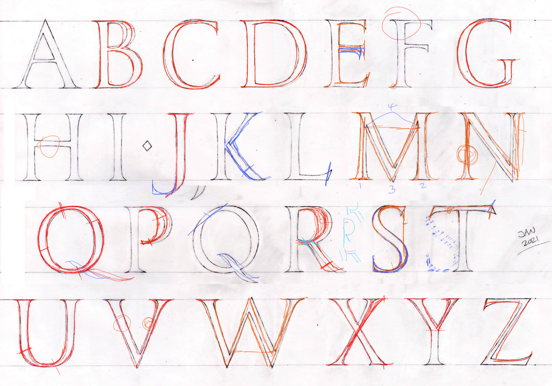 My first draft of a 'Trajan' alphabet, showing Charlotte's corrections. 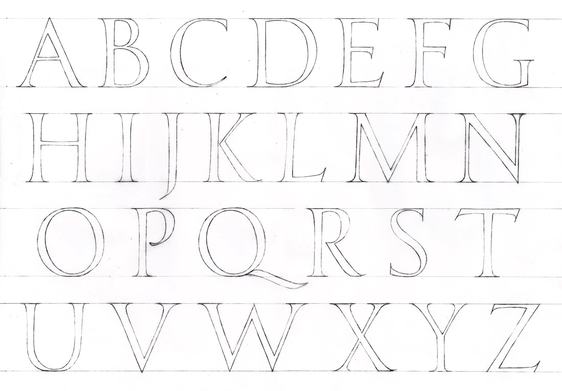 My completed 'Trajan' alphabet. The fact that there has to be extrapolation from the original column text to meet the requirements of a modern typeface means that there is no definitive version - a fact both frustrating (but what's the answer!) and freeing (does it follow the general rules of an alphabet? Then it is probably 'right'). 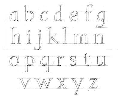 My lowercase 'trajan' style alphabet from memory. 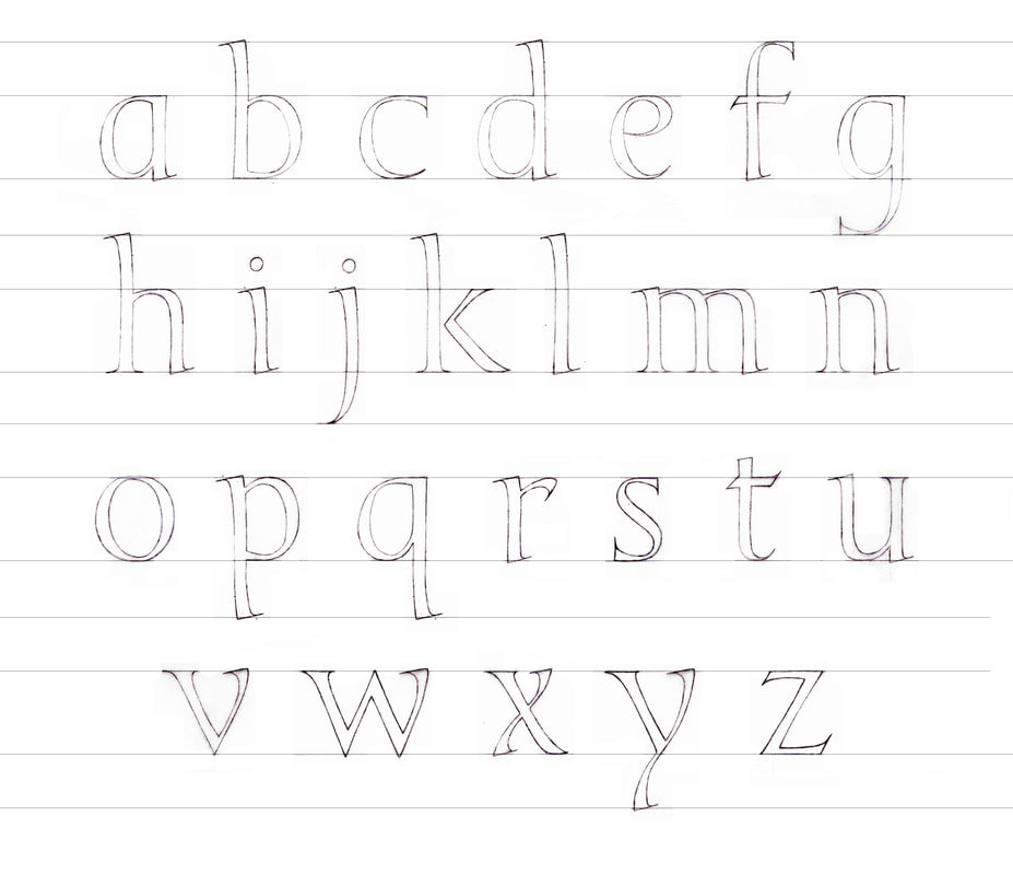 The final draft of my 'Trajan' style lowercase alphabet following Charlotte's corrections. |
AuthorHeather Griffith is a stone mason from Scotland, and currently taking part in The Lettering Arts Trust Journeyman Scheme for 2020/21. Archives
June 2021
Categories |
 RSS Feed
