|
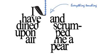
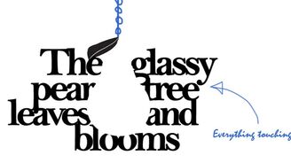
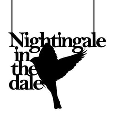
I feel my brains, like a pear, to see if it's ripe; it will be exquisite by September. -Virginia Woolf 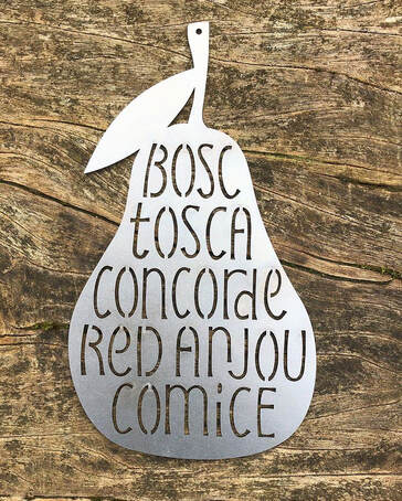 Vector-designed letters laser cut into Corten steel - Photograph by Charlotte Howarth As part of my LAT Journeymanship, my tutor Charlotte Howarth set me on a project to encourage diversity of thought within lettering methods - and to pick up some new and highly valuable skills along the way. The task was to design a lettering piece to be vectorised and cut into Corten steel. 'Corten steel is also known as weathering steel, or COR-TEN steel. A thin layer of oxide forms on the outside surface of the steel, giving it that attractive burnt orange finish, and protects it from the elements and further corrosion.' - www.buymetalonline.co.uk As Corten steel is a popular outdoor material, Charlotte suggested I design something for the garden, something that might 'hang from a tree'. The brief was very open and so I began by thinking literally - what hangs from trees..? My first thought happened to be caterpillars, but I couldn't make it feel quite right. 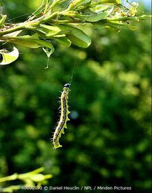 Caterpillars. Yes... but no. Perhaps pears? I designed a variety of options, with pears carrying the theme. My first thought when lettering to a theme is to search through databases of poems, and sometimes I chance upon something special that remains with me: I have wasted the day... I have wasted the day in the fields and the lanes, I have tramped in the leaves and the mud; I have dined upon air and scrumped me a pear And an apple the colour of blood. Though my fingers are purple from blackberry stains, Though my hair is a tangle of straw; Though my jacket was torn upon bramble and thorn, My binoculars bent in a foolish ascent -- It was worth it for all that I saw. It was worth all the aches, it was worth all the pains -- I have rambled and scrambled and raced; And my elbow is scratched and my coat must be patched, And I waded in brooks and neglected my books, And I startled a hare (and the taste of that pear!) What waste, what a glorious waste! -Felix Dennis
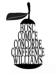
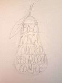
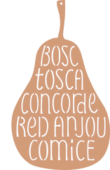
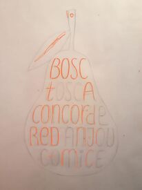
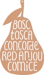
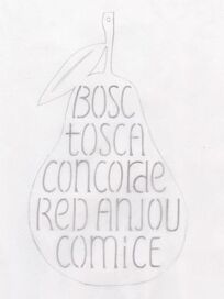
I produced a variety of designs to potentially be lasercut in Corten steel. After a Zoom meeting with Charlotte, and with a reality-check on the more complicated ones, we identified the one below to go ahead with:
A progression of drafts from idea to finished product. Consideration had to be given to designing letters that didn't contain a disconnected shape, and some thought was given to the thickness of the lettering in relation to the thickness of the steel. I had some hope that the process might leave me with a bag of solid inverted letters, but the lines were too thin to leave whole shapes. The steel was cut by Laserfast Limited in Norfolk, and left outside in my garden to ripen to the colour of deep-orange rust. 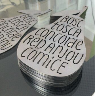 The pears are being sold through The Lettering Arts Trust Shop or you can email me on [email protected]!
0 Comments
|
AuthorHeather Griffith is a stone mason from Scotland, and currently taking part in The Lettering Arts Trust Journeyman Scheme for 2020/21. Archives
June 2021
Categories |

 RSS Feed
