 For this project I worked with my Journeyman tutor, Louise Tiplady.
0 Comments
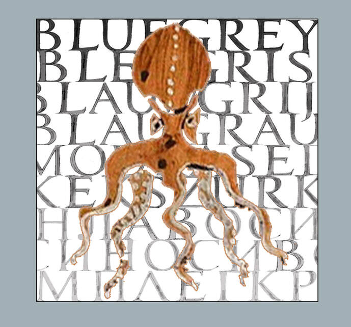
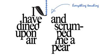
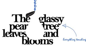
I feel my brains, like a pear, to see if it's ripe; it will be exquisite by September. -Virginia Woolf 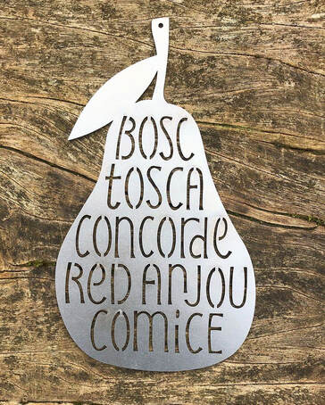 Vector-designed letters laser cut into Corten steel - Photograph by Charlotte Howarth As part of my LAT Journeymanship, my tutor Charlotte Howarth set me on a project to encourage diversity of thought within lettering methods - and to pick up some new and highly valuable skills along the way. The task was to design a lettering piece to be vectorised and cut into Corten steel. 'Corten steel is also known as weathering steel, or COR-TEN steel. A thin layer of oxide forms on the outside surface of the steel, giving it that attractive burnt orange finish, and protects it from the elements and further corrosion.' - www.buymetalonline.co.uk As Corten steel is a popular outdoor material, Charlotte suggested I design something for the garden, something that might 'hang from a tree'. The brief was very open and so I began by thinking literally - what hangs from trees..? My first thought happened to be caterpillars, but I couldn't make it feel quite right. 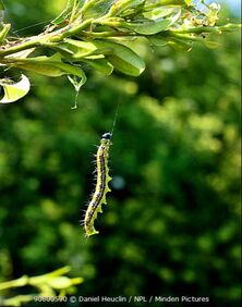 Caterpillars. Yes... but no. Perhaps pears? I designed a variety of options, with pears carrying the theme. My first thought when lettering to a theme is to search through databases of poems, and sometimes I chance upon something special that remains with me: I have wasted the day... I have wasted the day in the fields and the lanes, I have tramped in the leaves and the mud; I have dined upon air and scrumped me a pear And an apple the colour of blood. Though my fingers are purple from blackberry stains, Though my hair is a tangle of straw; Though my jacket was torn upon bramble and thorn, My binoculars bent in a foolish ascent -- It was worth it for all that I saw. It was worth all the aches, it was worth all the pains -- I have rambled and scrambled and raced; And my elbow is scratched and my coat must be patched, And I waded in brooks and neglected my books, And I startled a hare (and the taste of that pear!) What waste, what a glorious waste! -Felix Dennis
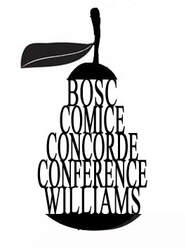
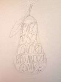
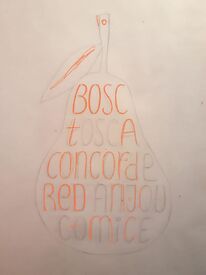
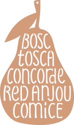
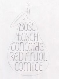
I produced a variety of designs to potentially be lasercut in Corten steel. After a Zoom meeting with Charlotte, and with a reality-check on the more complicated ones, we identified the one below to go ahead with:
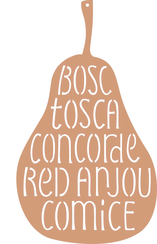
A progression of drafts from idea to finished product. Consideration had to be given to designing letters that didn't contain a disconnected shape, and some thought was given to the thickness of the lettering in relation to the thickness of the steel. I had some hope that the process might leave me with a bag of solid inverted letters, but the lines were too thin to leave whole shapes. The steel was cut by Laserfast Limited in Norfolk, and left outside in my garden to ripen to the colour of deep-orange rust. 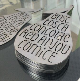 The pears are being sold through The Lettering Arts Trust Shop or you can email me on [email protected]!
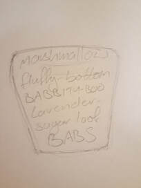
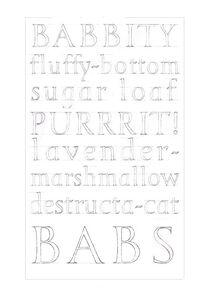
A look back on the time following my SPAB Fellowship journey.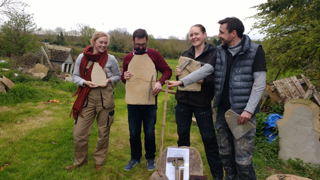  How did I hear about the Fellowship? I first became aware of the SPAB’s William Morris Craft Fellowship during an interview for my apprenticeship with Historic Environment Scotland, where I saw stonemason Chuck Jones’ (2006 Fellow) Fellowship certificate displayed on the wall. It appeared significant and yet at the time it was unknown to me, and I resolved to find out more. Soon afterward I met Graham Campbell (1994 Fellow), my lecturer at Historic Scotland’s Elgin Cathedral Depot where I attended college and trained as a stonemason. Graham’s lectures often drew from his experiences gained on the Fellowship and he spoke very highly of the programme. Additionally, two of former student Steven Laing’s (1997 Fellow) own apprentices were in my year group, and with these precedents, I began to aspire to a Fellowship journey of my own. By the beginning of 2016, I had transferred to HES’s Glasgow Cathedral Depot, led by Works Manager Johnnie Clarke (2013 Fellow) and District Works Manager Erik Ramsay (2000 Fellow). With the influence of so many previous fellows, it was a natural step to apply to the SPAB following my own apprenticeship - to develop my own sense of the philosophy of conservation, and to bring this approach back to my workplace. What was my experience on the program? During my Fellowship I was lucky enough to have the company of fellow stonemason Thom Kinghorn-Evans; stained-glass conservator Lizzie Hippisley-Cox and slate-roofer Peter McCluskey as we toured the country visiting craftspeople and heritage experts. I found the lasting benefits of the program to be the close contacts made during the total 6 months of travelling, whether on sites of historical interest or during visits to factories, studios, homes and workshops. I had a particular love of the hands-on opportunities, too many to list here in full, but that included: stonemasonry; thatching; blacksmithing; pargeting; brickmaking; mud-building; stained-glass repair; gilding; carpentry; and firing up our own lime kiln at the The Centre for Alternative Technology in mid-Wales. Other unforgettable moments included watching molten lead poured to form sand cast lead sheet, and getting close enough during the cleaning of the ‘Quadriga’ statue above the Wellington Arch to read the makers names engraved into the wings of Peace. The most influential experiences occurred during the final phase of the Fellowship, where we are encouraged to dive into our own particular interests. For me, it was the time spent in Graciela Ainsworth’s Sculpture Conservation studios, learning about the delicate and precise work of a conservator – something which had always appealed to me as a conservation stonemason - and ultimately my week at the City & Guilds of London Art School during a ‘taster’ of their BA (Hons) course in Historic Carving that hooked me in. I applied to join the course that following year. What has that led to since in my career? Shortly after graduating from the City & Guilds of London Art School I had the equally good fortune of being mentored by lettering artists Charlotte Howarth and Louise Tiplady through a placement on The Lettering Arts Trust's 9th Annual Journeyman Scheme, designed to give new carvers the skills, training and confidence required to become fully self-employed. What are my plans for the future? I have recently moved to Devon and I am currently looking for a studio, whilst carving from home and building up the basis for my own business. I am looking forward to visiting the workshops of my LAT Journeyman mentors as soon as Covid restrictions allow – much as been achieved digitally yet it is hard to beat being hands-on when it comes to carving tuition. This year also sees me going full-circle to become a Trustee of William Morris Craft Fellowship Trust. In this role I hope to help continue funding the placement of Fellows: to keep the philosophy of building repair in live discussion whilst training our craftspeople in the skills to best preserve our built heritage the world over.  #Whattodowithallthesealphabets? 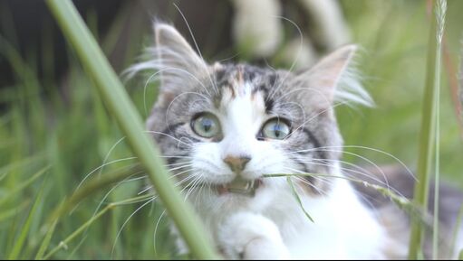 Meet Babette: Maine Coon x Siberian and original Destructa-cat. After working with my LAT Journeyman tutor Charlotte Howarth to refine a 'Trajan style' uppercase and lowercase alphabet, the time was right to put my new letters to work. Charlotte shared an idea with me for an collaboration, which was exciting in itself, as I have never yet worked collaboratively with another lettering artist (although it is an idea I have been fascinated by since I first saw lettering artist Rachel Yallop's Letter Exchange lecture about her calligraphy collaboration with lettering artist Michael Clark). 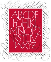 An example of successful collaboration - Rachel Yallop and Michael Clark Charlotte knows that I have a big softy of a cat that often journeys across the keyboard mid-zoom call, and was interested in what a 'his and hers' carving might look like if we each made an artwork out of the terms of endearment for our respective pets. At first I didn't think I had enough terms for my cat to fill a page, but after I consciously listened to what I actually call her daily, other than her name, I realised that I most definitely did. (She is a very vocal cat and mostly I mimic her own noises back at her, out of which 'purrrit!' made the cut.) After filtering out the still affectionate yet overly-negative sounding ones ('worst cat in the world', 'fish hooks', 'absolute horror-kitten') I was left with a list to start laying-out:  The best ideas are drawn directly onto tabletops
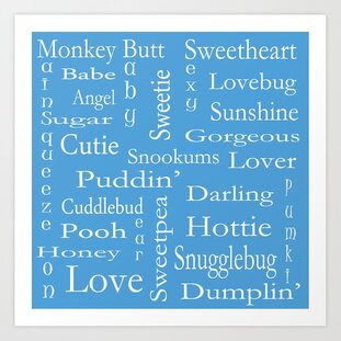
First task was to search examples of similar ideas online for inspiration. The 'word cloud' design on the left appeared to be popular, but as you can see I was drawn to the example on the right - a simple portrait-dimensioned stack of words with different styles/emphasis on different lines. As this was specifically an uppercase and lowercase alphabet design task, I decided to alternate between lines of entirely one and then the other:
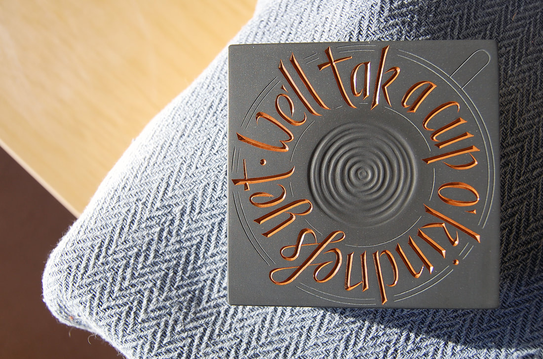
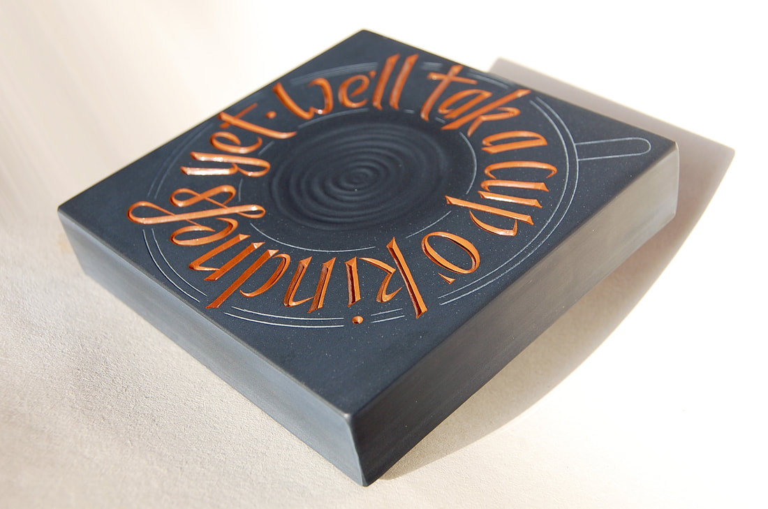
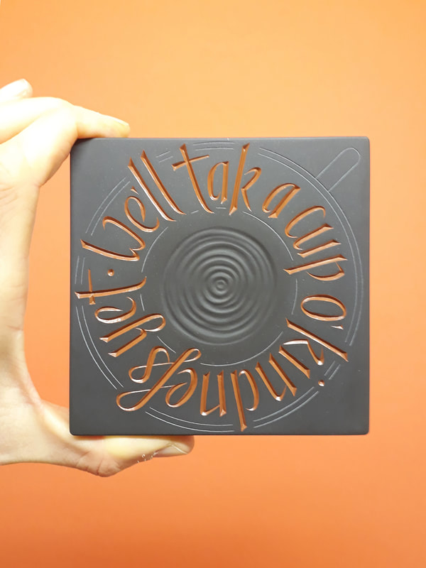
I am always pleasantly surprised when Charlotte likes an idea, and she is a very supportive tutor in her enthusiasm. As it was a collaboration to produce a paired set, I was more than ready to drop my draft in preference for Charlotte's layout, yet it was agreed to go ahead with what I had presented. The layout was adopted by Charlotte for her own version of her very sweet and funny pet nicknames. It was a playful project and I had enjoyed putting it together. A few spacing challenges remained, and I was going mad shuffling the lines about digitally, so in the end I printed out all the options and cut out each line, then pushed them about on the floor until I had reached the most pleasing solution: 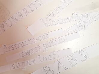 I still have them. 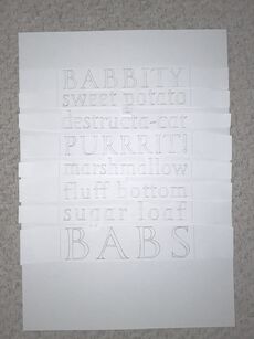 Like Tetris only with ascenders and descenders. 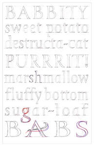 The magic red pen which makes everything right - refining solutions for areas of negative space with the introduction of a double-storey 'g' and a flourish on the 'A'. 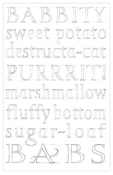 Final draft - ready to carve in Moleanos limestone when restrictions allow home and studio visits.  With options to lightly texture the stone with a silhouette before carving. This project is a great example of a piece of work which could easily lend itself to personalised commissions as well as being a lot of fun to work on. 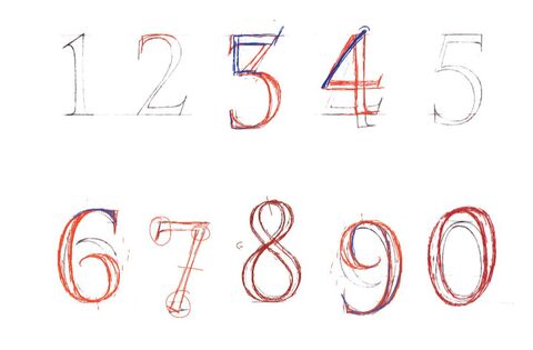 My first numbers draft showing Charlotte's corrections. Numbers! In my last post I mentioned my certainty that I must already know all there is to know about letters through the mere act of existing and moving through the world - and my subsequent struggles when it came to capturing their essence in detail. Numbers were no different. I remembered my City and Guilds of London Art School tutor, Tom Young, explaining that some numbers sat above the line whilst others fell below it. A little knowledge can be a dangerous thing as it came to recalling which did what - and resulted in the tangled mess above as I stretched and shrunk what I thought I knew of numbers to what I thought I knew about layout. Luckily for me I have my LAT Journeyman tutor, Charlotte Howarth, to straighten me out me: 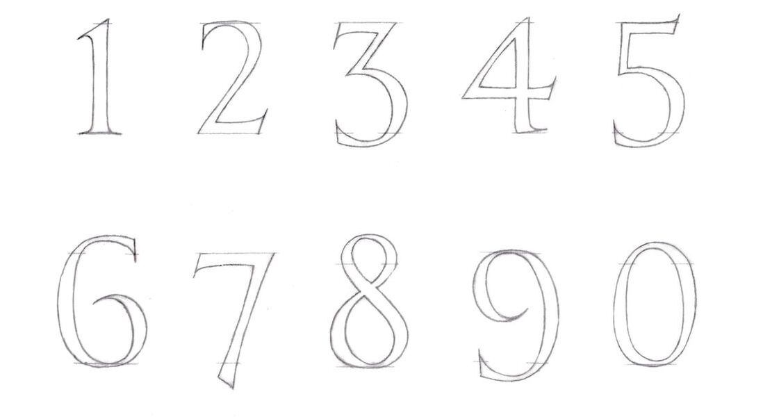 Second draft, and what a difference. 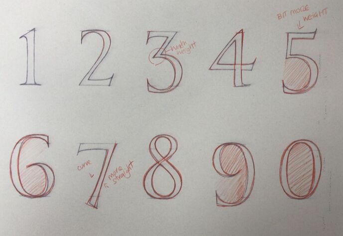 Yet not without Charlotte reminding me that perfection is a long game. 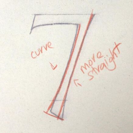 But worth it when you get beautiful things like this number '7' appearing in your inbox. 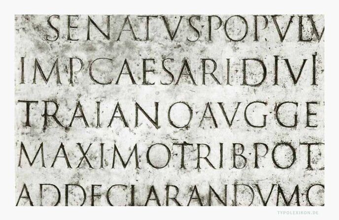 The marble plaque of the 'Columna Traiana' in Rome. 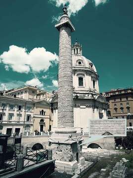 The Trajan Alphabet: "...The Roman capitals have held the supreme place among letters for readableness and beauty. They are the best forms for the grandest and most important inscriptions." - Edward Johnston The most popular Roman capitals are to be found on the Trajan Column - a triumphal column in Rome commemorating the Roman emperor Trajan's victory in the Dacian Wars. At its base, it features a marble plaque considered by many to contain the most beautiful surviving example of 'Capitalis Monumentalis' script - and with sufficient text to form an alphabet (with the exception of H, J, K, U, W, Y, Z). (The modern alphabet has grown since, with the letters 'J', 'U' and 'W' added during the Middle Ages - read more about the Trajan alphabet and Capitalis Monumentalis script (translation required).) When, back in 2017, I was lucky enough to study for a few days with the renowned lettercutter Richard Kindersley, my very first task was to draw out a Roman alphabet based on the Trajan Column example, from memory. From memory, easy! After all, what does your eye take in more of every day than letters. Letters are everywhere I look, and I had had 31 years of absorbing them. This was going to be a cinch. Except... which are the thin strokes on a 'W' and which are the thick? How does the junction at the centre of an 'R' form, exactly? Just how wide is an 'M'? Is the crossbar of an 'A' the same height as the crossbar on an 'E'? (it isn't...) And just what do the curves on an 'S' think they are playing at, really?  'The typometry of the Roman capitals in the two-line system consists of straight lines and curves, or the basic forms square, triangle and circle. Nothing has changed to this day. Example set from Linotype's Trajan.' (from typolexikon.de) 'A Lot of People Don't Know What Lowercase "G" Looks Like And We're Not Even Kidding' - ScienceAlert.com It was a fantastic learning exercise and therefore no coincidence that my LAT Journeyman tutor Charlotte Howarth also tasked me with an alphabet as a fundamental step in my learning - an important return to basics and a useful tool to 'see where I am at' with my own understanding and personal development of form. First was the Trajan alphabet, as we understand it in full modern form, an uppercase version and a lowercase: 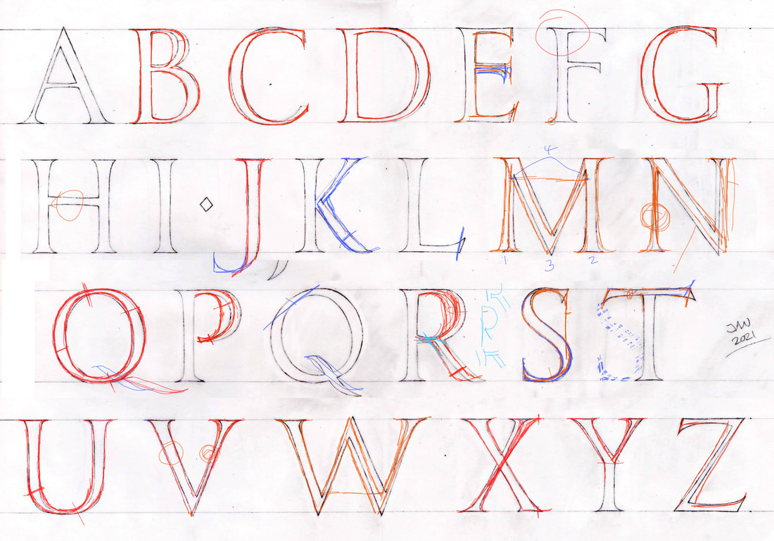 My first draft of a 'Trajan' alphabet, showing Charlotte's corrections. 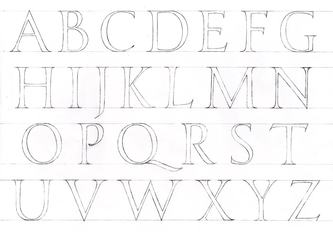 My completed 'Trajan' alphabet. The fact that there has to be extrapolation from the original column text to meet the requirements of a modern typeface means that there is no definitive version - a fact both frustrating (but what's the answer!) and freeing (does it follow the general rules of an alphabet? Then it is probably 'right'). 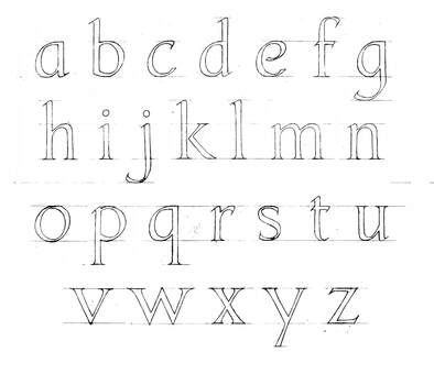 My lowercase 'trajan' style alphabet from memory. 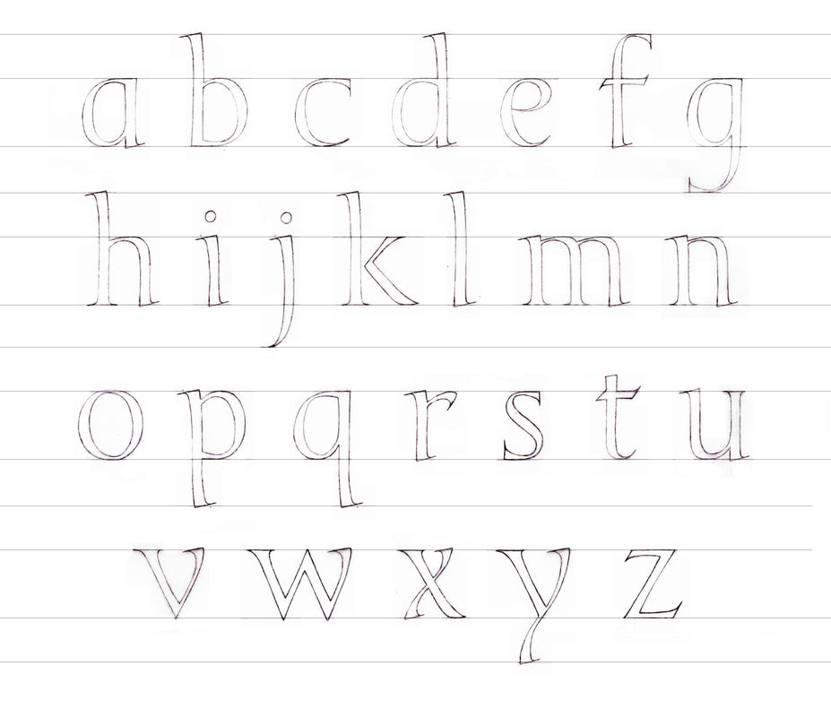 The final draft of my 'Trajan' style lowercase alphabet following Charlotte's corrections. 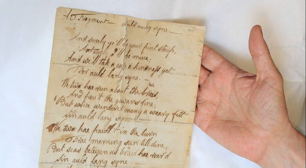 A section of Burns’s handwritten manuscript for ‘Auld lang syne’ © The National Trust for Scotland The Lettering Arts Trust Journeyman Scheme of 2020/21 begun with the first task: to create a seasonally themed object for sale in The Lettering Arts Centre shop in Snape Maltings. Under the tuition of professional lettering artist, Charlotte Howarth, I drafted a range of designs from which we chose one - based on a line from the traditional Scottish Hogmanay song by Robert Burns - to refine and take to completion. The original design was based on Burns' handwriting from a sample manuscript, and the letterforms were then adapted for regularity and clarity. The strongest remaining influence is the use of a 'long s', which was phased out from print during the mid-1970s yet persisted in handwriting through to the second half of the 19th century: "In handwriting (...) the long s is usually confined to preceding a 'short s', either in the middle or at the end of a word—for example aſsure, Bleſsings: this pairing looks like the German ß, which is known as the Eszett." (Source - Wikipedia 'Long s') Design meeting were held in the mornings over video conferencing and I was given advice on layout, spacing, the importance of regular letterforms, painting, and every aspect from choosing to apply lines by scribe, to the finish of the texture. 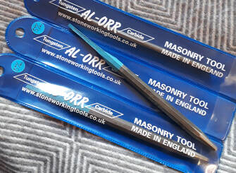 On the advice of Charlotte, I purchased a new 3mm ‘Al-Orr’ brand marble lettering chisel, ordered directly from the R H & G Travis & Son Ltd workshop in West Yorkshire. I could not be happier with the cut produced by this chisel, and it makes carving the high quality slate very kindly sent to me by Louise Tiplady a complete joy. The finished design is called 'Cup 'O Kindness' and is due to go on sale in store at the Lettering Arts Trust and online under smaller works and gifts. It measures 100 x 100 x 20mm and is drilled to wall mount on a single fixing. 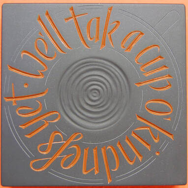 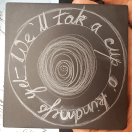 Each step from idea to completion.  I am extremely honored to have been selected for The Lettering Arts Trust's 2020 Journeyman Scheme under the guidance of Charlotte Howarth and Louise Tiplady! Training begins digitally, and I will share the progress on this blog. And here it is! The end of the two week extension.
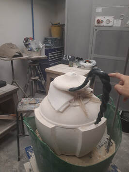
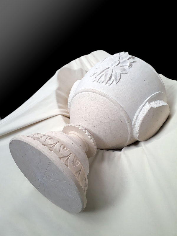
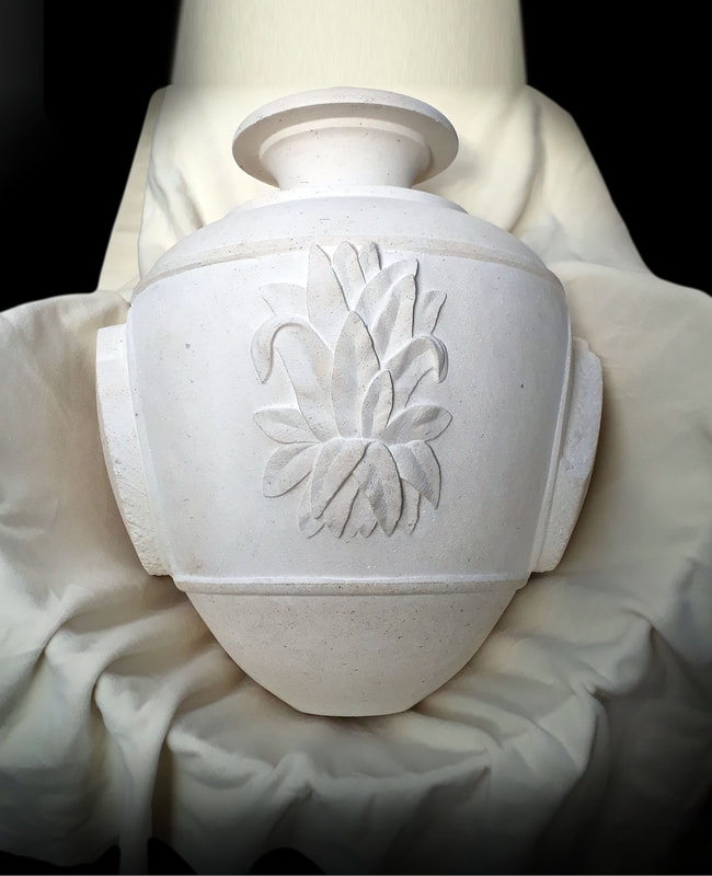
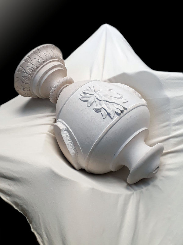
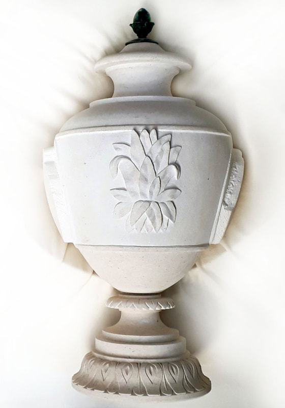
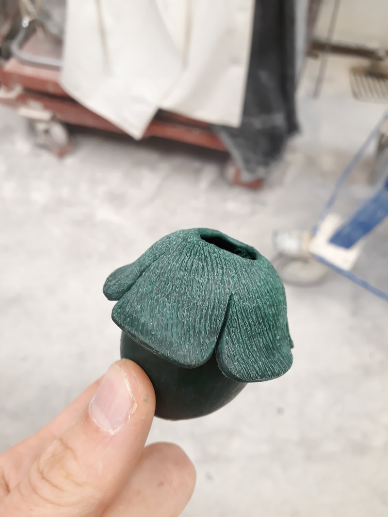
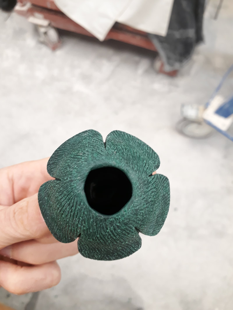
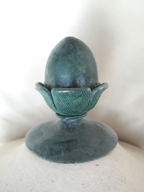
To this: I have achieved the bronze medal in getting things ready for casting in time... This is the acorn which will sit at the very top of the finished urn.
|
AuthorHeather Griffith is a stone mason from Scotland, and currently taking part in The Lettering Arts Trust Journeyman Scheme for 2020/21. Archives
June 2021
Categories |

 RSS Feed
