|
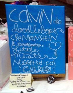
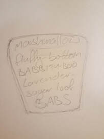
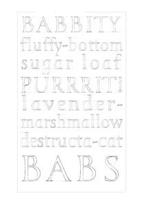
#Whattodowithallthesealphabets? 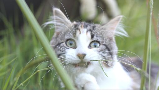 Meet Babette: Maine Coon x Siberian and original Destructa-cat. After working with my LAT Journeyman tutor Charlotte Howarth to refine a 'Trajan style' uppercase and lowercase alphabet, the time was right to put my new letters to work. Charlotte shared an idea with me for an collaboration, which was exciting in itself, as I have never yet worked collaboratively with another lettering artist (although it is an idea I have been fascinated by since I first saw lettering artist Rachel Yallop's Letter Exchange lecture about her calligraphy collaboration with lettering artist Michael Clark). 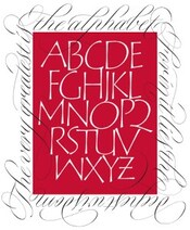 An example of successful collaboration - Rachel Yallop and Michael Clark Charlotte knows that I have a big softy of a cat that often journeys across the keyboard mid-zoom call, and was interested in what a 'his and hers' carving might look like if we each made an artwork out of the terms of endearment for our respective pets. At first I didn't think I had enough terms for my cat to fill a page, but after I consciously listened to what I actually call her daily, other than her name, I realised that I most definitely did. (She is a very vocal cat and mostly I mimic her own noises back at her, out of which 'purrrit!' made the cut.) After filtering out the still affectionate yet overly-negative sounding ones ('worst cat in the world', 'fish hooks', 'absolute horror-kitten') I was left with a list to start laying-out:  The best ideas are drawn directly onto tabletops
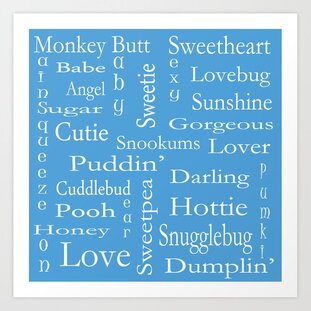
First task was to search examples of similar ideas online for inspiration. The 'word cloud' design on the left appeared to be popular, but as you can see I was drawn to the example on the right - a simple portrait-dimensioned stack of words with different styles/emphasis on different lines. As this was specifically an uppercase and lowercase alphabet design task, I decided to alternate between lines of entirely one and then the other:
I am always pleasantly surprised when Charlotte likes an idea, and she is a very supportive tutor in her enthusiasm. As it was a collaboration to produce a paired set, I was more than ready to drop my draft in preference for Charlotte's layout, yet it was agreed to go ahead with what I had presented. The layout was adopted by Charlotte for her own version of her very sweet and funny pet nicknames. It was a playful project and I had enjoyed putting it together. A few spacing challenges remained, and I was going mad shuffling the lines about digitally, so in the end I printed out all the options and cut out each line, then pushed them about on the floor until I had reached the most pleasing solution: 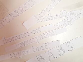 I still have them. 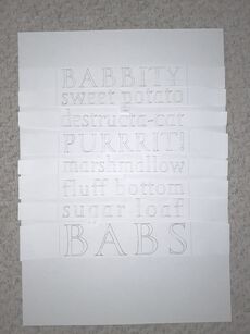 Like Tetris only with ascenders and descenders. 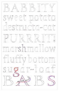 The magic red pen which makes everything right - refining solutions for areas of negative space with the introduction of a double-storey 'g' and a flourish on the 'A'. 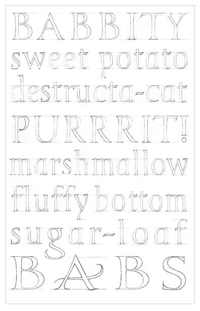 Final draft - ready to carve in Moleanos limestone when restrictions allow home and studio visits. 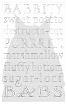 With options to lightly texture the stone with a silhouette before carving. This project is a great example of a piece of work which could easily lend itself to personalised commissions as well as being a lot of fun to work on.
0 Comments
Leave a Reply. |
AuthorHeather Griffith is a stone mason from Scotland, and currently taking part in The Lettering Arts Trust Journeyman Scheme for 2020/21. Archives
June 2021
Categories |
 RSS Feed
